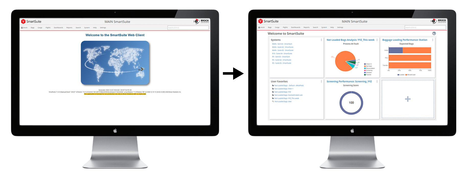
SmartSuite Landing Page
Project Date: Summer/Fall 2020
SmartSuite is Brock Solution's software product offering for Airport and Airline clients. The landing page is the first screen that users visit upon opening the SmartSuite web client. As the lead designer on Brock’s Web Frameworks team, I helped transform this page from a static splash screen to a rich, informative, and easily-customizable launchpad for all types of SmartSuite users.
Background & Problem
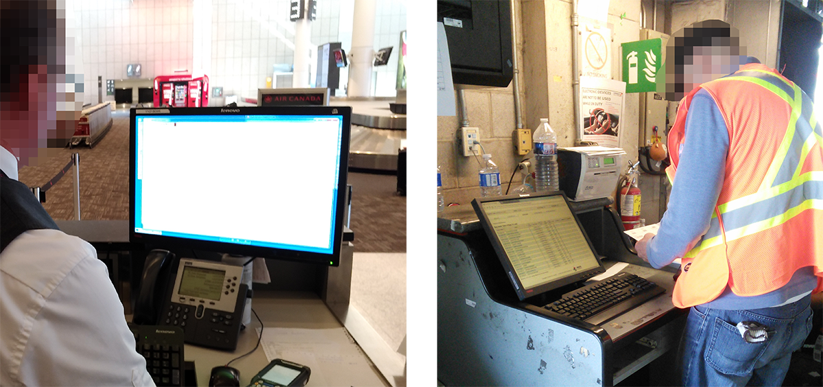
The SmartSuite Web Client is a multi-purpose platform that enables many types of users to perform operational tasks, run advanced reporting and data analysis, and monitor performance in an airport context. Given the multitude of different ways that users use this feature-rich platform, the ability to curate and streamline one’s experience is essential.
The SmartSuite Web Client, while being feature-rich, did not allow users to easily access their most-frequented pages and tools or enable them to view multiple key performance indicators in one place. The user journey bottleneck was ultimately the menu, which could slow down users from quickly getting where they needed to go. The landing page serves as an approachable gateway for users to access the features and information they need.
Working with product management and the Web Frameworks development team, my role was to advise and collaborate on requirements and strategy, engage with end users, as well as design and prototype the landing page and justify my decisions to stakeholders. I also supported development through design specification and supplying visual assets.
Users & Audience
The users of the landing page are airport or airline employees that primarily make use of our Web Client to perform their tasks. These personas include, but are not limited to:
All of these users have varying priorities and make use of different features, analytics, and tools within the web client. Therefore, creating a static experience that would meet all of their needs simultaneously was untenable long-term. Thus, there was a need for user segmentation, and eventually customization.
The primary device used to access our Web Client in an airport setting is a PC, due to the complexity of many of our operational features. However, mobile phones are gaining increased usage in this setting for access of data, dashboards, and baggage details.
Scope and Constraints
After analyzing the problem and user segments, we determined that this project would need to be broken up into multiple phases in order to continuously deliver value to our customers.
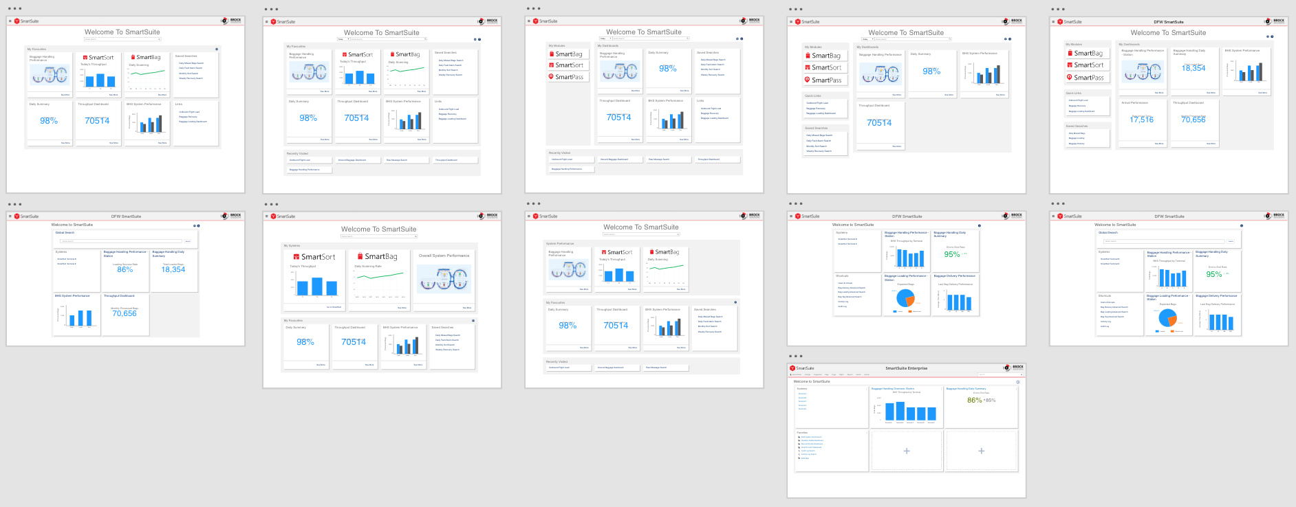
The first phase would be to design two separate landing pages without personalization capabilities, in order to broadly address our two main customer types: airports and airlines. The landing pages would differ only in the types of data shown by default, as these customer groups have vastly different KPIs and dashboards.
The second phase would build off of the groundwork laid in the first phase, adding the ability to customize and tailor the experience for more specialized user segments of the aforementioned customers.
Phase 1: Foundation
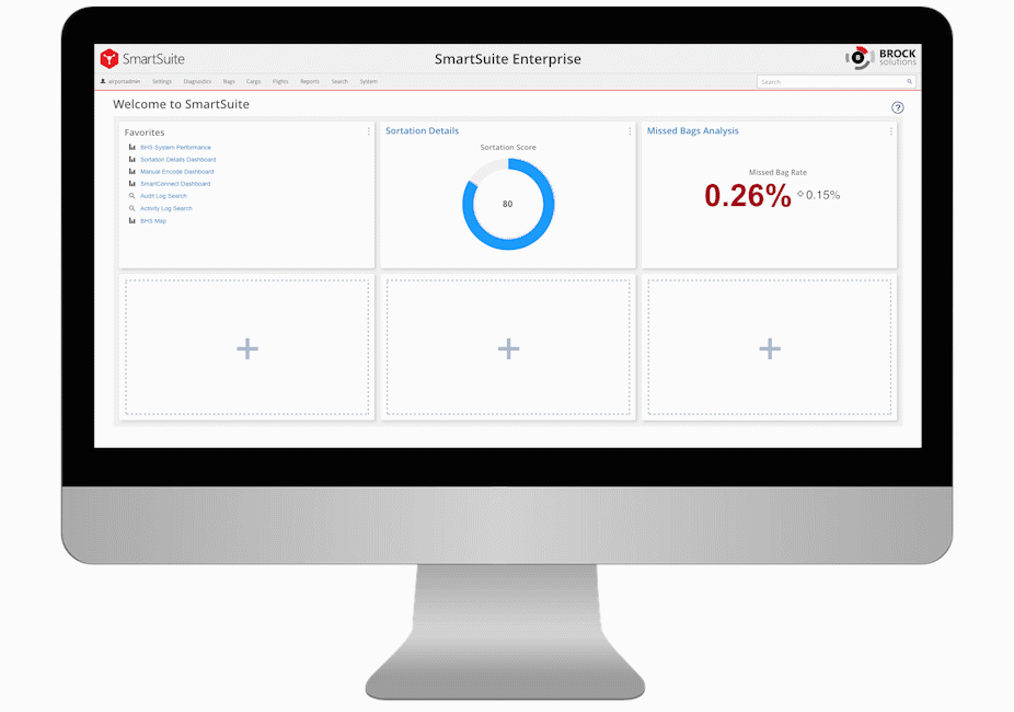
In order to address the first phase of the requirements, I designed many possibilities for how the features and widgets would be displayed and accessed. During this phase, the landing page needed to be able to show data visualizations from dashboards and link to various web client features or other systems.
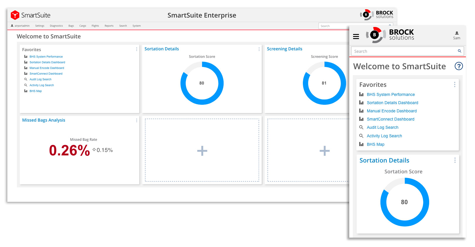
Data Visualizations
Previously, I had worked on SmartSuite’s dashboard framework and had defined standards and best practices for all of the dashboards we create. Our dashboards, which summarize the performance of various processes, are all to be designed with an obvious sense of hierarchy between the widgets. This sense of hierarchy, wherein one data visualization summarizes the overall performance of the process, allowed for a one-size-fits-all approach to representing dashboards on the landing page.
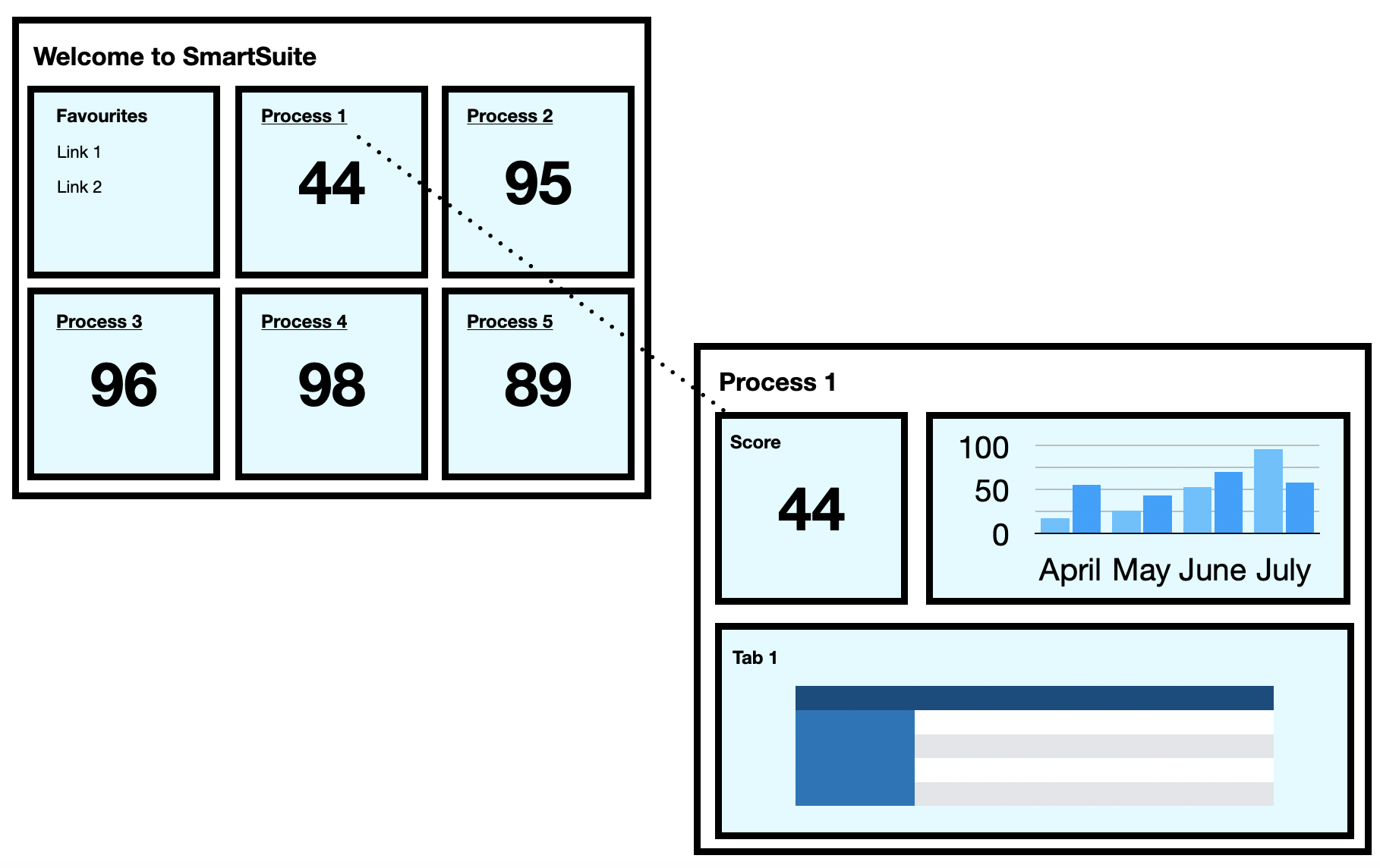
The data visualizations link to dashboards where users can see more in-depth details about a certain process. There is a significant difference between the types of data that airport and airline users are interested in, so the dashboards represented are different between the two types of users. The dashboards were determined based on usage and overall importance to our existing customers - with the full knowledge that they would eventually be customizable.
Operational Features
Shortly before implementing the landing page, I designed SmartSuite’s favoriting system, which enables users to add pages to their “favourites” for quick access. Previously, this only appeared in the menu or helped to determine priority when using the search function. With the landing page, this feature can take center stage and enable users to quickly access the features they need most upon login.
Layout
I created several potential layouts for the landing page while bearing in mind the eventual customizability that would be built into it. This phase began in conjunction with our menu redesign, and while early concepts featured our "Global Search" function, I ultimately advocated for that feature to become part of our menu, thereby being accessible from anywhere in our web client.
At the end of this iteration, stakeholders and myself determined that an even 3x2 grid would prove to be the most versatile and functional for the current stage of the project. This decision was based on the number of widgets available at the time, screen real estate, and the future need for simple yet robust customization.
It was important that we provide our users with enough slots to customize, while keeping the page simple and above-the-fold on desktop PCs. I also advised that we cap the number of widgets at 6 to avoid endless scrolling on mobile devices.
Phase 2: Customization
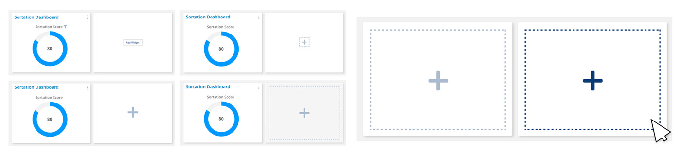
With the foundation in place, phase 2 was focused on customization. Customizing the landing page needed to be intuitive, predictable, and effortless so that users can easily tailor their experience. For this reason, I did not opt to create any sort of separate “edit” mode, preferring instead to let users interact with and modify the landing page at any time.
To begin, it was crucial that the ability to add widgets was very obvious. I created many possible designs for the “add” function but ultimately settled on the one that was deemed most “clickable.”
Next, I needed to make adding the desired widget effortless. To do so, I divided the types of widgets into two possible categories: quick links and dashboards. Because the list of “Quick Links” widgets is so short, I opted to place them at the top of the list so that no scrolling would be necessary to access them.
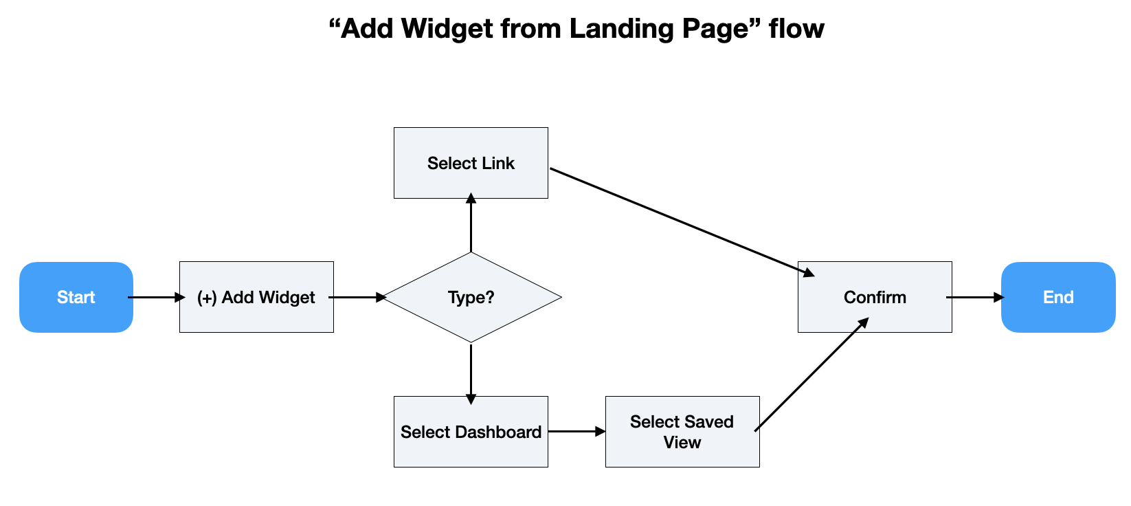
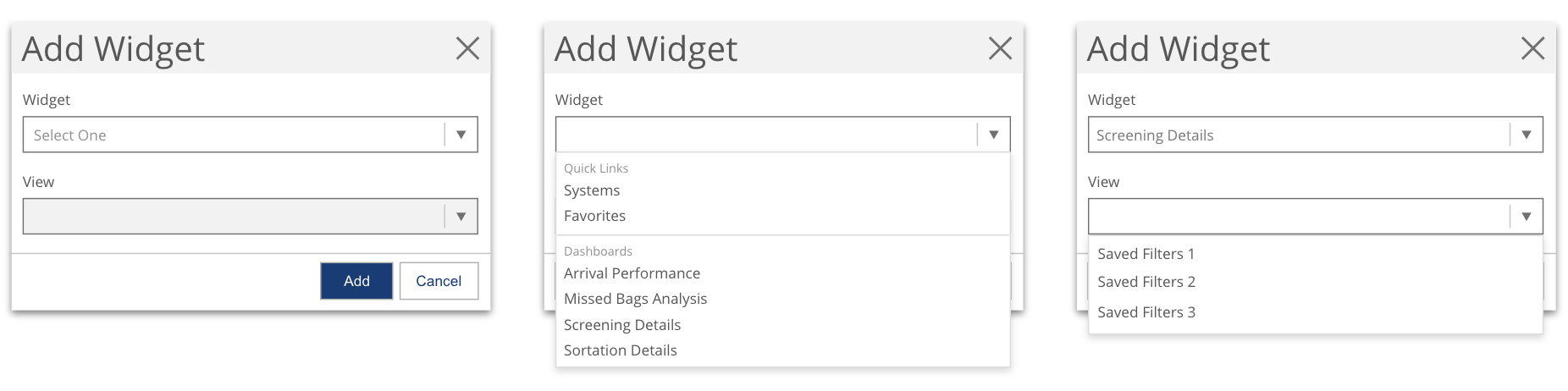
The “View” field within the “Add Widget” dialog enables users to choose which view or set of filters for a particular dashboard they wish to apply (it is disabled when Quick Links are selected). This integrates our saved filtering functionality so that users no longer have to view the default filters or time ranges.
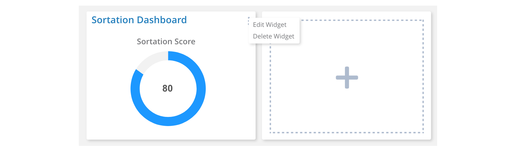
Users can also easily delete or edit a widget by accessing a menu in the top right corner of the panel.
Outcomes and Next Steps
Phase 2 of the landing page has only recently been shipped, but this feature will continue to evolve with the product. I will be closely monitoring the following metrics to determine where improvements or modifications will be needed, and sharing the insights with stakeholders:
Based on this data, as well as direct feedback from users, we will determine which improvements should be prioritized. Some possible enhancements may include richer customization of the layout, widget previews to support recognition over recall, or better instruction for first-time users.
I am excited to continue guiding the evolution of this feature.