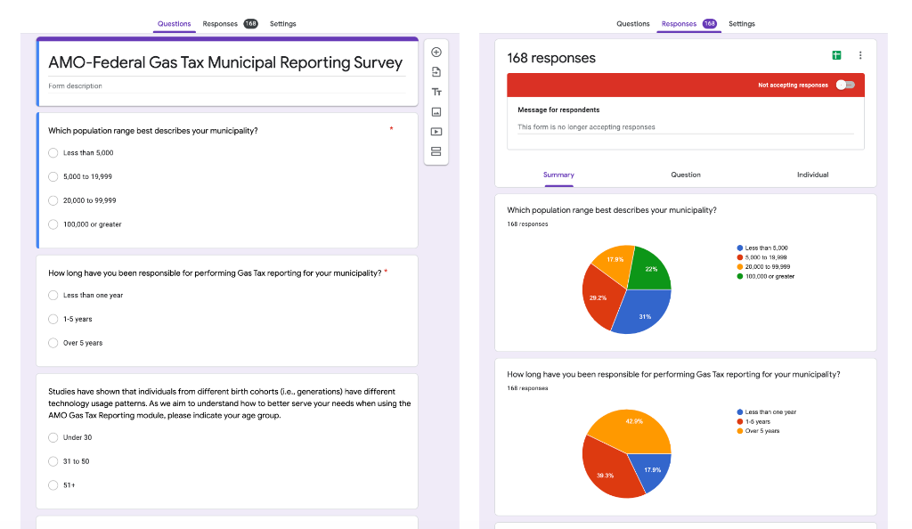
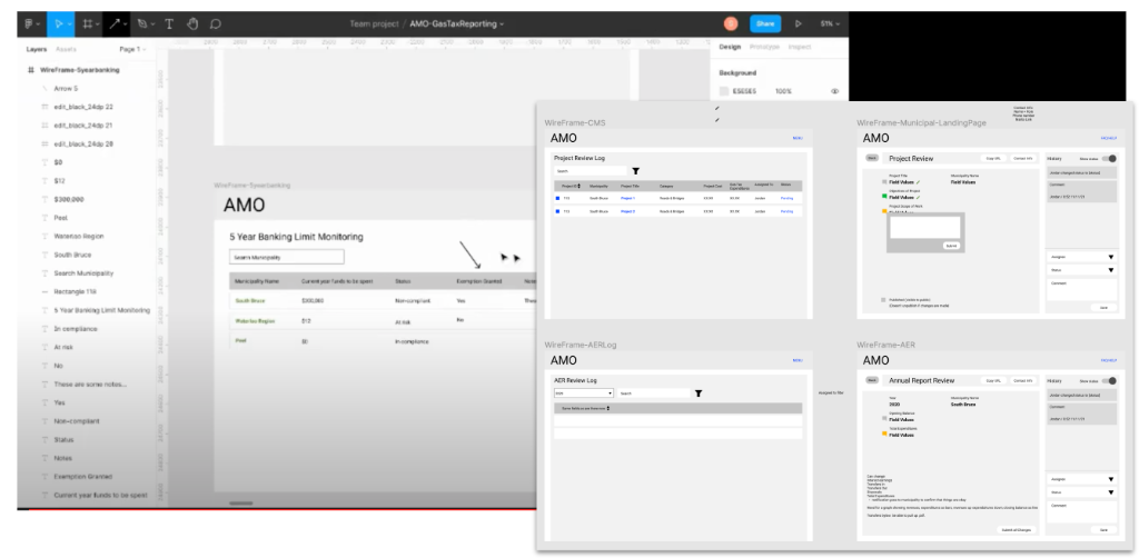
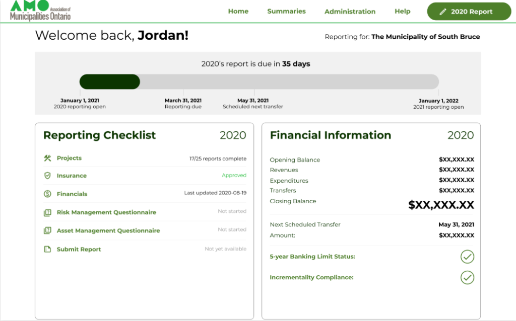
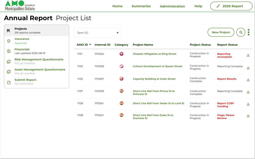
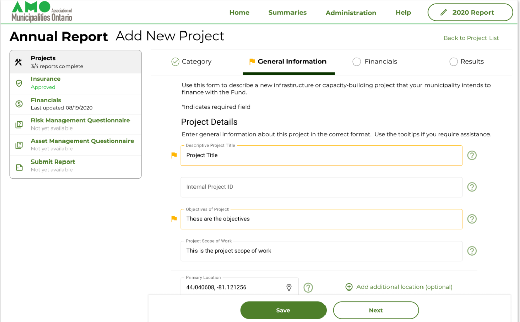
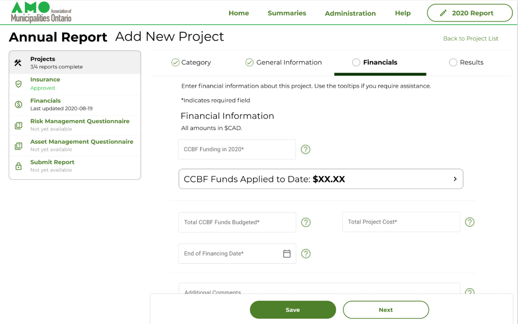
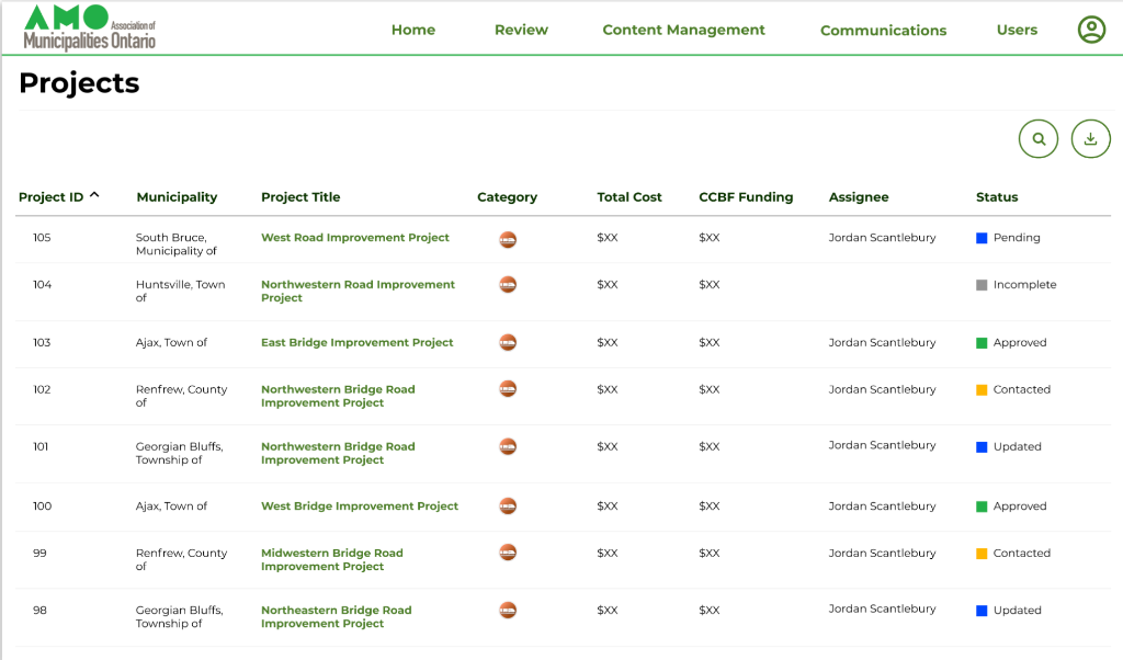
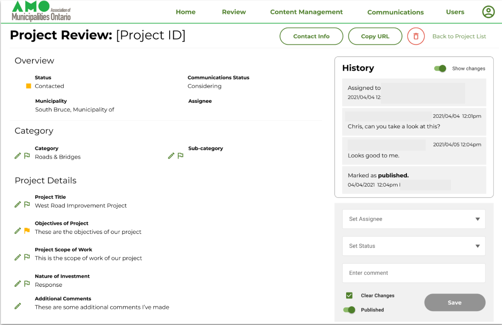
Redesigning a Municipal Reporting System

Lead UX Designer | Focus21 | 2021-2022

AMO administers the Canadian federal government's Canada Community Building Fund to 443 municipalities in Ontario. Each year, municipalities must report their use of funding through AMO's digital reporting system. In 2021, AMO engaged Focus21 to redesign their existing reporting site, which had been built in 2014 and no longer met user needs. As Lead UX Designer, I led the project from discovery through launch, conducting research, facilitating co-creation sessions, and designing solutions for three distinct user groups: municipal staff, AMO administrators, and communications contractors.

Hero image: Dashboard or homepage of the CCBF Reporting Site
Screenshot(s) of the old site or diagram showing the fragmented old system The existing system presented significant challenges for all users.

The Problem

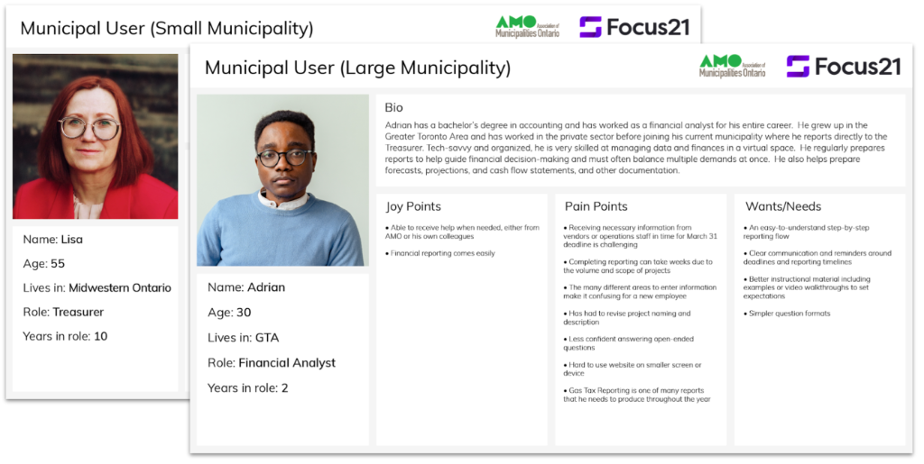
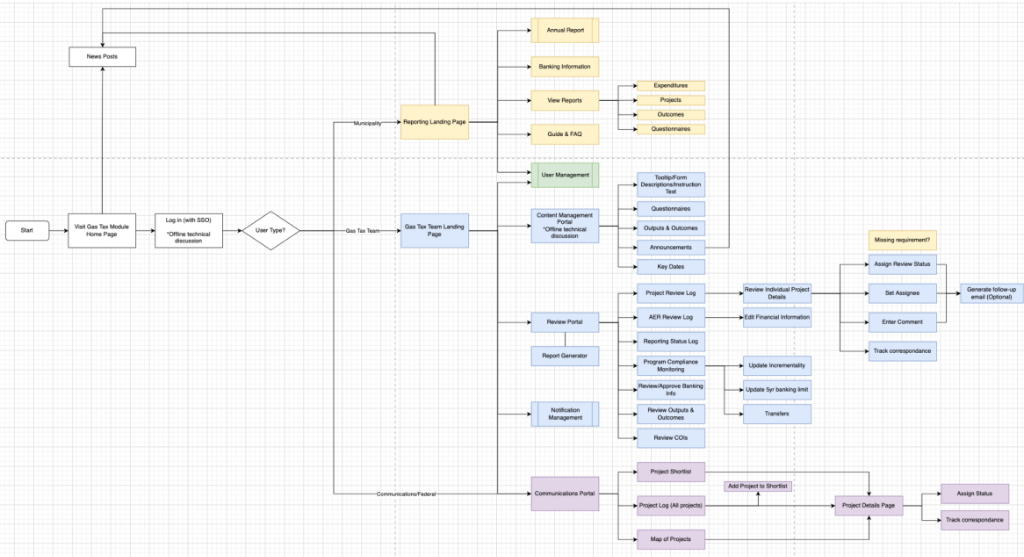
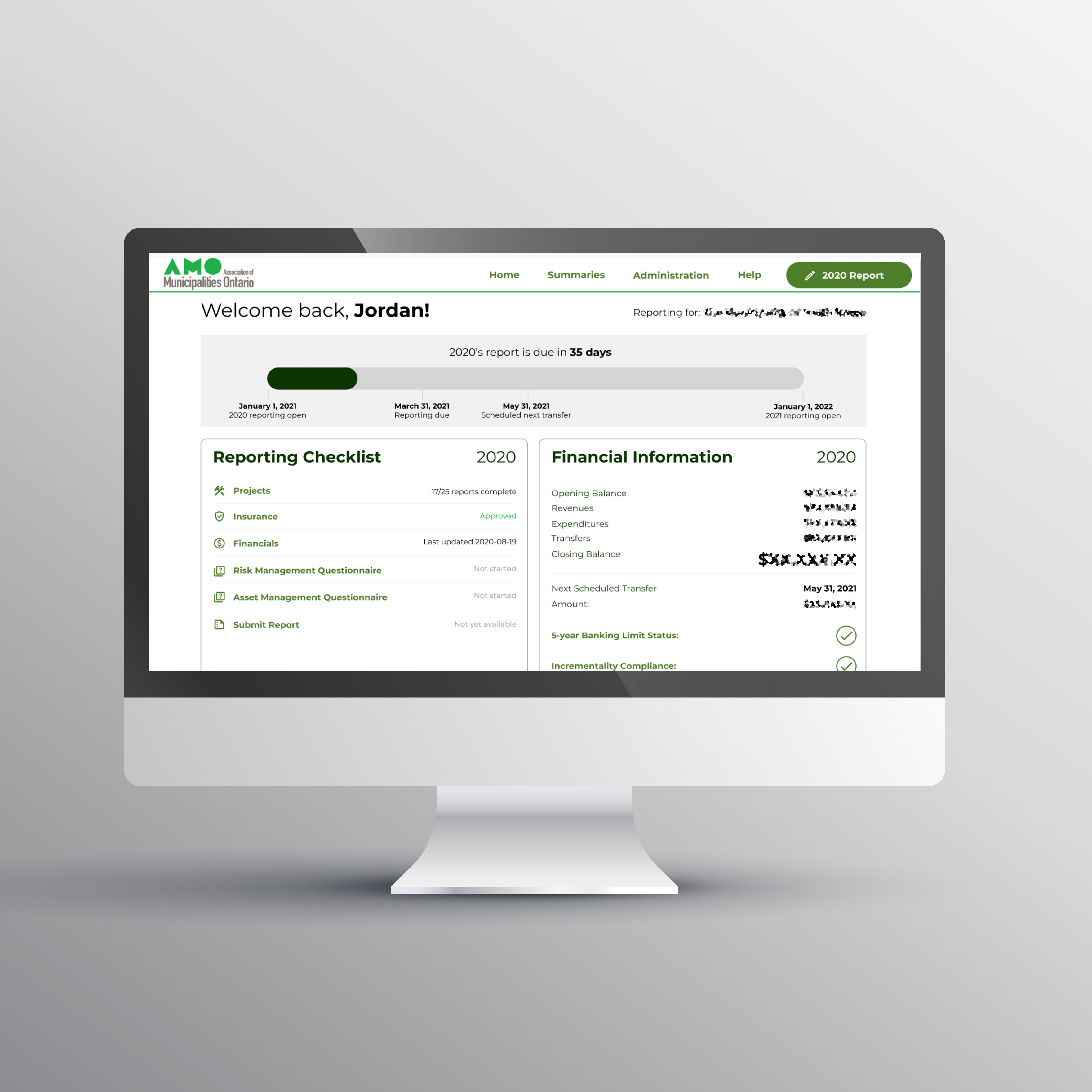
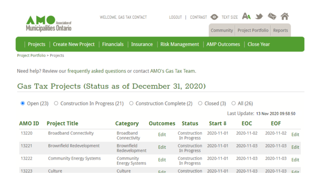
The existing system presented significant challenges for all users. Municipal staff struggled to navigate the site and understand how to complete their annual reports, with no checklist or dashboard to guide them through the process. AMO staff could only access data through SQL queries, having no user interface for reviewing submissions. The various components of the reporting system were scattered across different platforms rather than consolidated in one place. The site's limitations were preventing AMO from efficiently managing the fund and were creating frustration for the 443 municipalities required to report annually.

Discovery & State Mapping

I began the project with a comprehensive discovery phase, starting with current state mapping workshops. Working closely with stakeholders, I mapped out the existing reporting process to identify pain points and opportunities for improvement. This exercise revealed the complexity of the system and helped establish a shared understanding of the problems we needed to solve. The mapping sessions uncovered critical gaps in the user experience and highlighted areas where the system was creating unnecessary work for both municipal users and AMO staff.

Map of feature priorities Map of feature priorities

Feature Prioritization

Following current state mapping, I facilitated feature mapping and prioritization sessions with stakeholders. Together, we identified desired features and prioritized them based on user needs, business value, and technical feasibility. This collaborative approach ensured that we focused on the highest-impact improvements first while planning for future enhancements. The prioritization framework we developed helped guide decision-making throughout the project and kept the team aligned on what would be included in the MVP launch.

Survey results visualization or key findings summary Research provided quantitative data on pain points across 443 municipalities.

User Research

To understand the breadth of user experiences across all 443 municipalities, I distributed surveys to municipal staff who used the reporting system. The survey responses provided quantitative data on pain points and helped me identify patterns in how different types of municipalities approached the reporting process.

In addition, I conducted interviews with panels of municipal staff, AMO employees, and communications contractors.

The quantitative survey complemented the qualitative insights from interviews and gave me confidence that my prioritization, mapping, and planning would serve the diverse needs of AMO's users. I compiled all of my findings into a research report which was shared with the client.

Persona cards/profiles Personas captured the distinct needs of the different user groups

Personas

I synthesized all research findings into detailed personas representing our key user groups: municipal reporters, AMO administrative staff, and communications contractors. These personas captured the goals, frustrations, and workflows of each user type, providing a north star for design decisions throughout the project. By creating distinct personas, I ensured the team remained focused on solving real user problems rather than building features based on assumptions. The personas were particularly valuable in highlighting the different—and sometimes competing—needs of reporters versus reviewers.

Photos from co-creation sessions/workshop activities or workflow diagrams Co-creation sessions ensured requirements and business logic were correctly accounted for.

Co-Creation

Rather than working in isolation, I facilitated a collaborative co-creation process with stakeholders throughout the design and ideation phases. This approach ensured all requirements and business logic were correctly accounted for, gave stakeholders a sense of ownership over the end product, and created a shared understanding of product direction across client, development, and UX teams. The co-creation sessions were critical to navigating the complexity of the CCBF program's rules and requirements, allowing subject matter experts to contribute directly to the design process.

Workflow diagrams created during design phase Workflows mapped out user journeys and data flow.

Workflows

I developed detailed workflows mapping out user journeys through the reporting process for each user type. These workflows became essential communication tools between UX, development, and the client, ensuring everyone understood how data would flow through the system and how different user roles would interact with it.

One of the project's core challenges was designing for both the reporting and reviewing sides of the equation—municipal users needed to submit information while AMO staff needed to review and manage those submissions. The workflows helped me identify where these two experiences intersected and where they needed to diverge.

Wireframe examples Wireframes defined structure, navigation, and functionality.

Wireframes

After establishing workflows, I created wireframes to define the structure and functionality of each screen. The wireframes focused on creating clear navigation paths, progress indicators, and contextual help for municipal users who needed to complete their reports. For AMO staff, I wireframed tools that would allow them to review submissions and access data without requiring SQL queries. The wireframing process involved multiple iterations based on stakeholder feedback, ensuring the final designs addressed real-world use cases and business logic.

Style guide or component library excerpt A WCAG 2.1 compliant design system based on Material Design principles.

Design System

I oversaw a junior designer as they developed a color palette and style guide based on AMO's brand guidelines and Material Design principles. As part of my responsibility, I ensured all components and colors met WCAG 2.1 AA accessibility standards, making the site usable for all municipal staff regardless of ability.

Municipal dashboard showing reporting status/checklist The dashboard gave users a clear view of their reporting status.

Design: Municipal Dashboard

For municipal users, I designed a dashboard that provided an at-a-glance view of their reporting status and a clear checklist of tasks to complete. This addressed one of the biggest pain points from the old system: users never knew where they were in the reporting process or what steps remained. The dashboard became the home base for municipal users, orienting them around the annual reporting cycle and reducing confusion about requirements.

Design: Reporting Interface

The municipal reporting interface guided users through entering their CCBF fund usage with clear form inputs, validation, and help text. I designed the flow to break complex reporting requirements into manageable steps (inspired by tax software), reducing cognitive load and making it easier for users to provide accurate information. Each screen included contextual guidance to help users understand what information was needed and why, addressing compliance requirements while maintaining a user-friendly experience.

One of the critical features I designed was the project entry and review process, which allowed municipal users to add, edit, and review their CCBF-funded projects before final submission. The interface provided clear feedback on data completeness and validation errors, helping users ensure their submissions met all requirements before submitting to AMO. This reduced back-and-forth between municipalities and AMO staff while improving data quality.

Design: AMO Staff Tools

Designing for AMO staff required solving a fundamentally different problem than designing for municipal users. I created an administrative dashboard that gave AMO staff visibility into submission status across all municipalities, allowing them to track compliance and identify municipalities that needed follow-up. The report review interface allowed AMO staff to efficiently review municipal submissions, flag issues, and communicate with municipalities about their reports.

I also designed data visualization and reporting tools that allowed AMO staff to analyze CCBF fund usage without requiring technical expertise, replacing the old system's SQL query requirement. Additionally, I created administrative tools that provided a simple visual interface to customize questionnaires, help docs, and site content, enabling the Fund to evolve over time.

Communications portal interface example Dedicated portal for communications contractors.

Communications Portal

I designed a dedicated portal for communications contractors that gave them access to CCBF-related content and data they needed for their work. This user group had been underserved by the old system, which was primarily built for municipal reporters. The communications portal provided appropriate access levels and functionality for communications contractors who needed to access CCBF information but weren't submitting reports themselves.

Feedback session documentation Training materials or user guide excerpt
Validation and training ensured a successful launch.

Outcome & Launch

Before launch, I conducted user feedback sessions to validate design decisions. These sessions confirmed that our solutions addressed key pain points and revealed minor usability issues we addressed before the January 2022 launch. As part of my role, I wrote UI requirements and user guides to support the site launch.

In mid-January 2022, we ran training sessions and published training material to help users transition to the new system. The site has remained in continuous use since launch, with ongoing agile improvements based on user feedback—a testament to the solid foundation established during the initial design and research phases. As of 2026, the system continues to serve AMO and Ontario municipalities effectively.